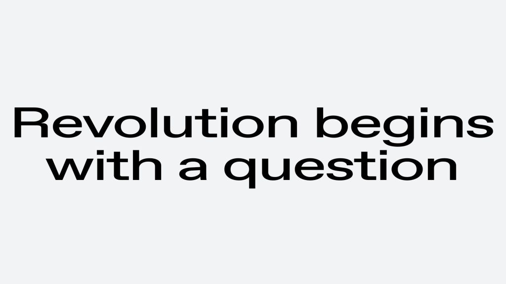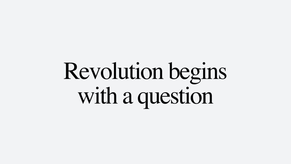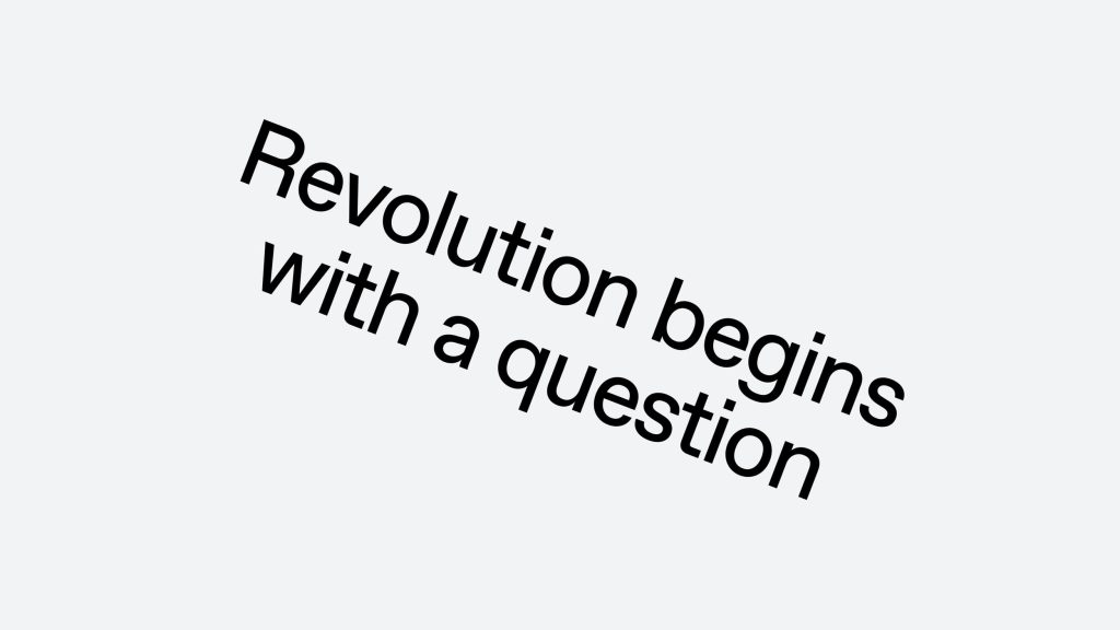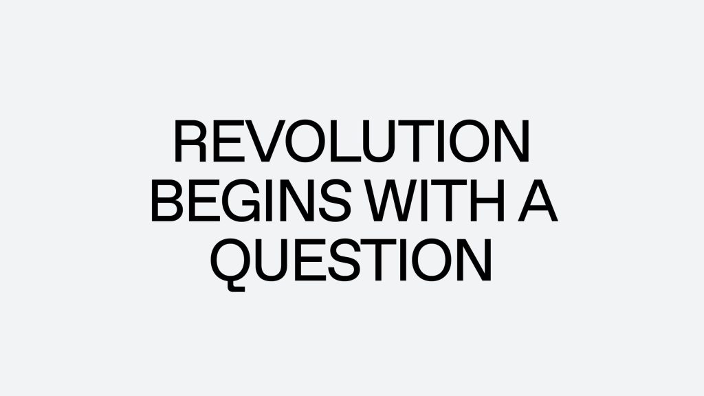
Follow the link to the right to download our typeface.
Typography
Primary Typeface
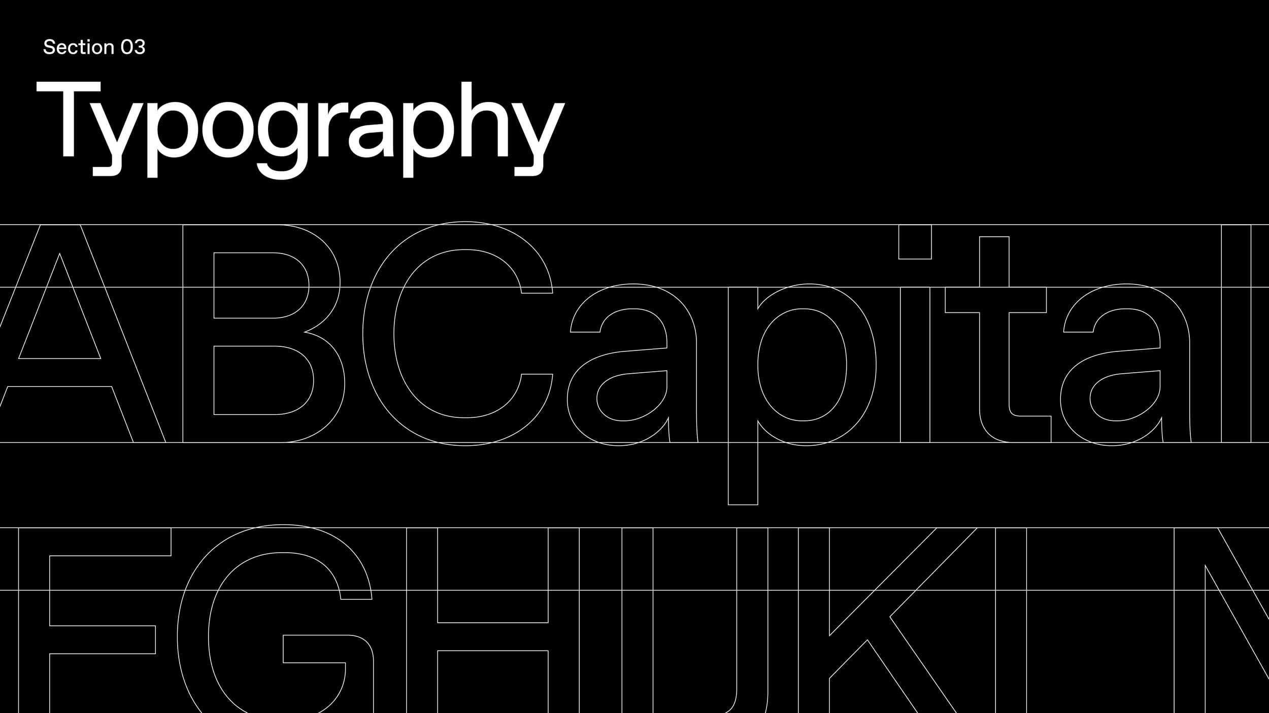
ABC Favorit is our primary typeface. Designed by Dinamo, it is a straightforward, low-contrast grotesque font combined with geometric rigidity. Please note that British English should be used when writing in English.
Typography
Secondary Typeface
An alternative to ABC Favorit is Space Grotesk on Google Font, although it should only be used as a last resort.
Typography
Weights
Regular ought to be used in the majority of cases to uphold the brand's simplicity. Bold, on the other hand, should be reserved solely for highlights, whilst italics are best suited for quotes and words originating from other languages.
ABC Favorit Regular
ABC Favorit Regular Italic
ABC Favorit Bold
Space Grotesk Medium
Space Grotesk Bold
Typography
Hierarchy
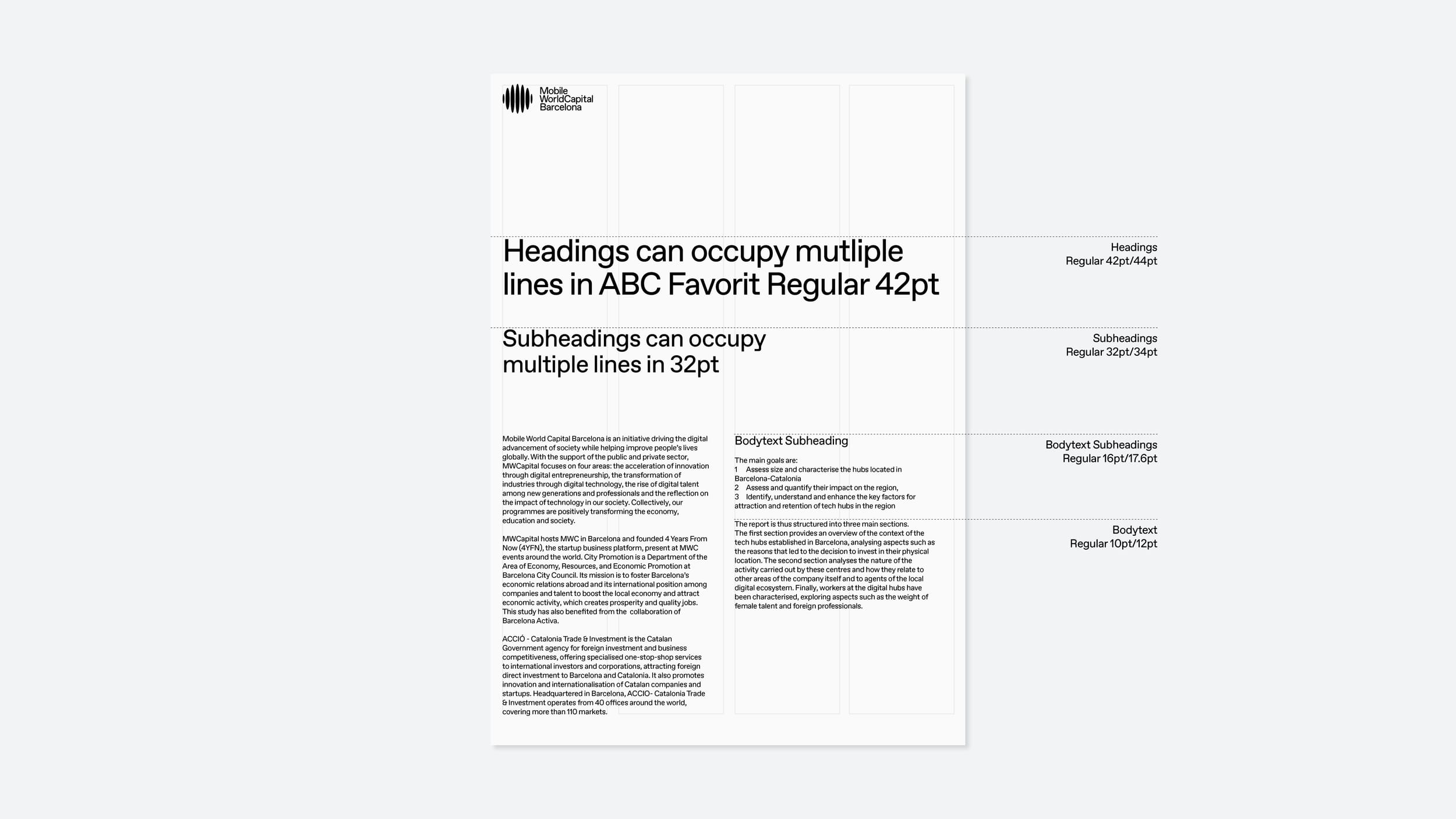
Size, scale and position all play a factor in how information is read. Always ensure there is a purposeful difference between type sizes.
Titles, Heading and Short Quotes
Regular 42pt/44pt
Subheadings and Paragraph Text
Regular 32pt/34pt
Body Copy Subheadings
Regular 16pt/17.6pt
Body Copy and Small Copy
Regular 10pt/12pt
Typography
Kerning
Leading should be optically adjusted to appear visually uniform.
Titles, Heading and Short Quotes
Regular 42pt/44pt
Subheadings and Paragraph Text
Regular 32pt/34pt



Typography
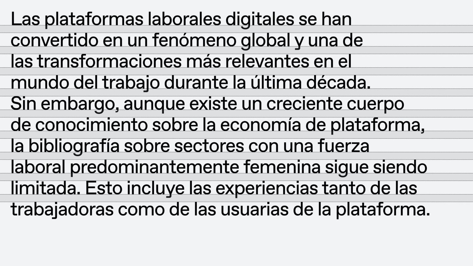
Leading
Leading should be optically adjusted to appear visually uniform.
Titles, Heading and Short Quotes
Regular 42pt/44pt
Subheadings and Paragraph Text
Regular 32pt/34pt
Subheads at 34pt would have 37.4pt leading.
Body Copy and Small Copy
Regular 10pt/12pt
Subheads at 12pt would have 13.2pt leading.



Typography
Setting Type
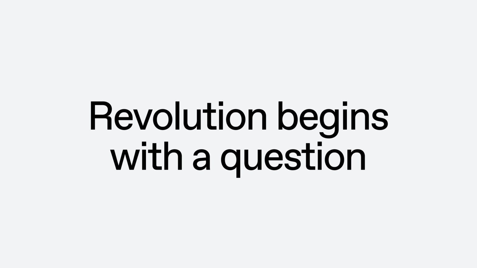
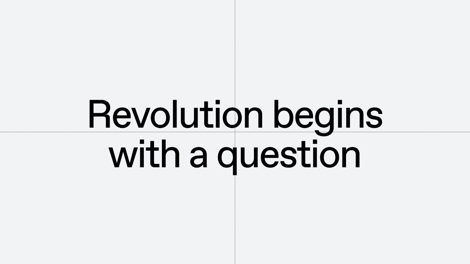
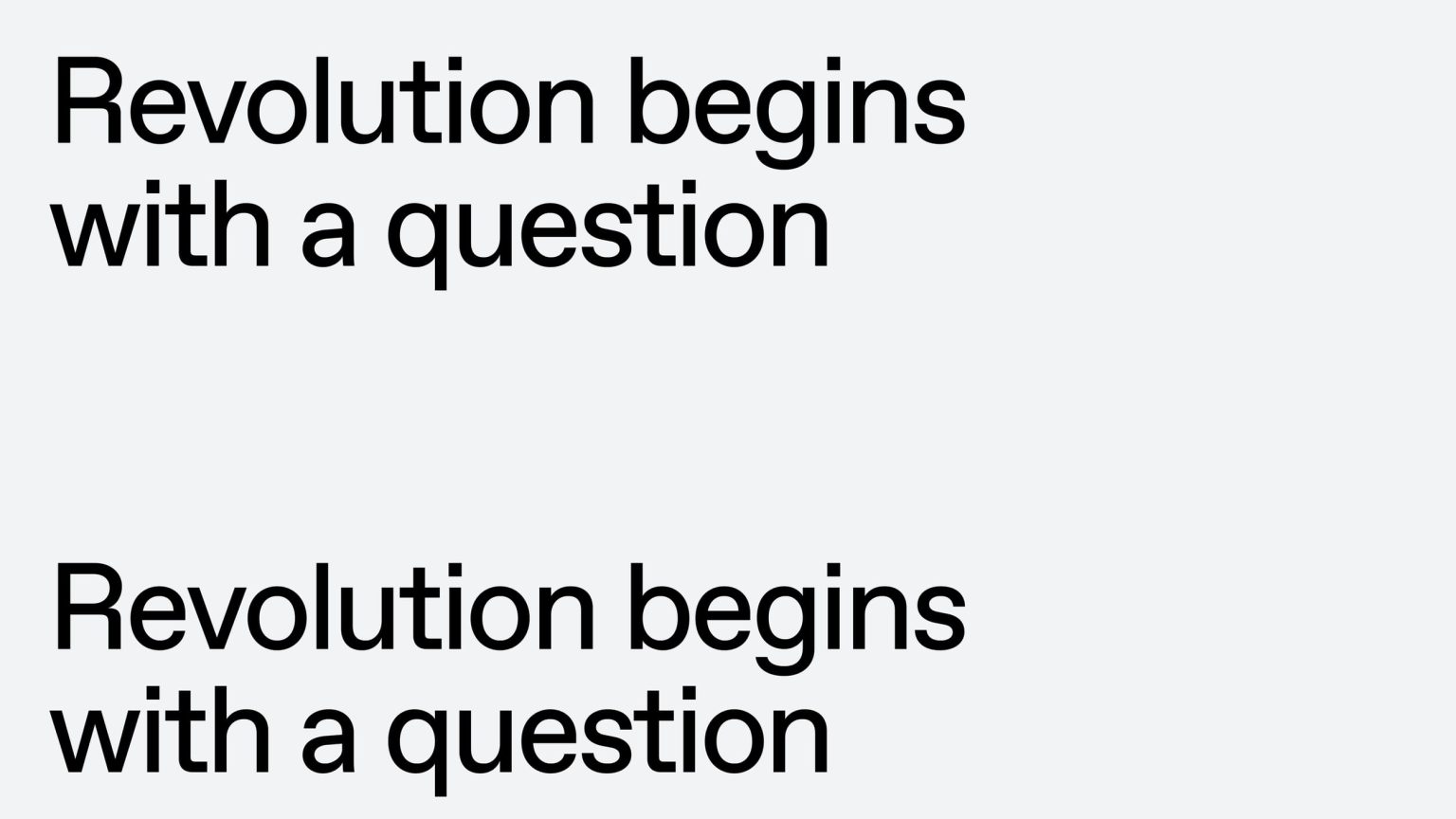
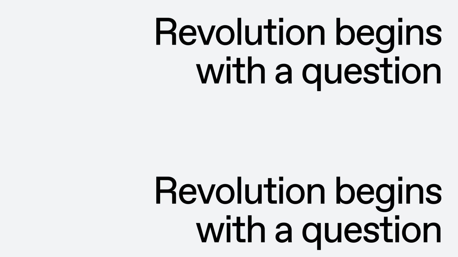
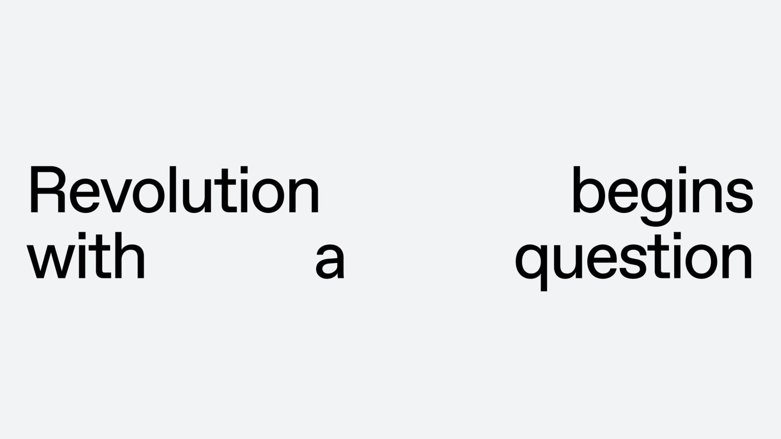
Typography should only ever be left-aligned or centred. Never right-align or force-justify typography.

Typography
Don’ts
Leading should be optically adjusted to appear visually uniform.
