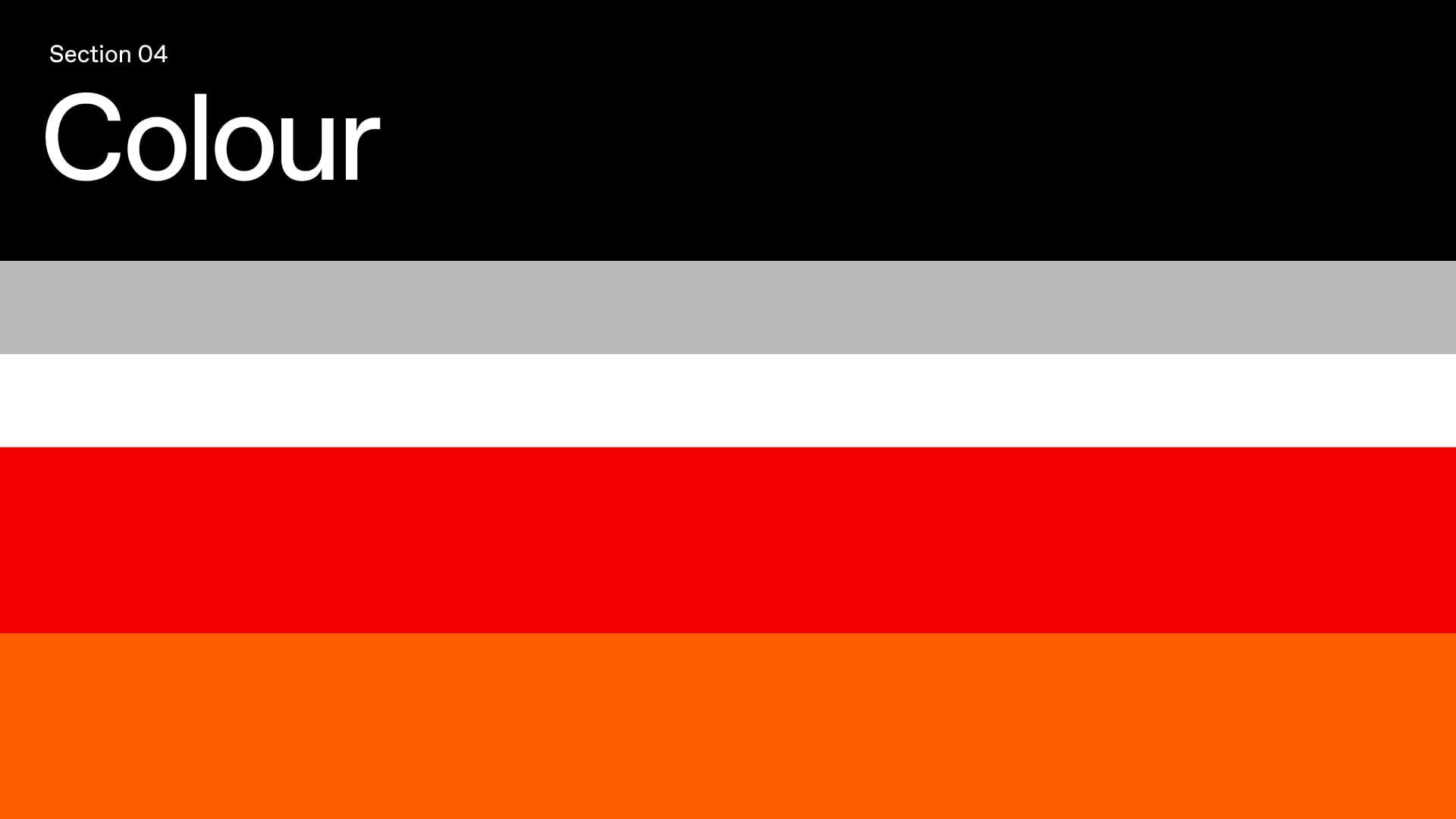
Colour
Primary Palette
The primary palette are the core colours employed in our identity. The vivid red and orange hues hold a special significance, reflecting the vibrant spirit of Barcelona. In contrast, the elegant pairing of black and white plays a crucial role in maintaining our brand's sophistication and timeless appeal.
Name:
CMYK:
RGB:
HEX:
PMS:
Red
0/100/100/13
222/0/0
#DE0000
485 C
Name:
CMYK:
RGB:
HEX:
PMS:
Dark Orange
0/59/100/0
255/105/0
#FF6900
1505 C
Name:
CMYK:
RGB:
HEX:
PMS:
Black
1/1/1/100
0/0/0
#000000
419 C
Name:
CMYK:
RGB:
HEX:
PMS:
Silver
0/0/0/27
186/186/186
#BABABA
421 C
Name:
CMYK:
RGB:
HEX:
PMS:
White Smoke
0/0/0/5
242/242/242
#F2F2F2
663 C
Name:
CMYK:
RGB:
HEX:
PMS:
White
0/0/0/0
255/255/255
#FFFFFF
663 C
Colour
Infographics Palette
For infographics, the colour palette has been expanded to help create contrast between data. These colours should only ever be used for infographics.
Name:
CMYK:
RGB:
HEX:
PMS:
Maroon
0/100/100/63
94/0/0
#5E0000
1815 C
Name:
CMYK:
RGB:
HEX:
PMS:
Dark Brown
0/58/100/75
64/27/0
#401B00
4625 C
Name:
CMYK:
RGB:
HEX:
PMS:
Dark Red
0/100/100/29
182/0/0
#B60000
485 C
Name:
CMYK:
RGB:
HEX:
PMS:
Saddle Brown
93/62/0/33
128/53/0
#803500
293 C
Name:
CMYK:
RGB:
HEX:
PMS:
Indian Red
0/58/58/23
197/82/82
#C55252
703 C
Name:
CMYK:
RGB:
HEX:
PMS:
Chocolate
0/58/100/20
204/85/0
#CC5500
717 C
Name:
CMYK:
RGB:
HEX:
PMS:
Tomato
0/60/60/0
255/102/102
#FF6666
178 C
Name:
CMYK:
RGB:
HEX:
PMS:
Coral
0/41/70/0
255/151/77
#FF974D
715 C
Name:
CMYK:
RGB:
HEX:
PMS:
Light Pink
0/30/30/0
255/179/179
#FFB3B3
169 C
Name:
CMYK:
RGB:
HEX:
PMS:
Sand
18/75/60/46
255/196/153
#FFC499
499 C
Colour
Infographics Examples
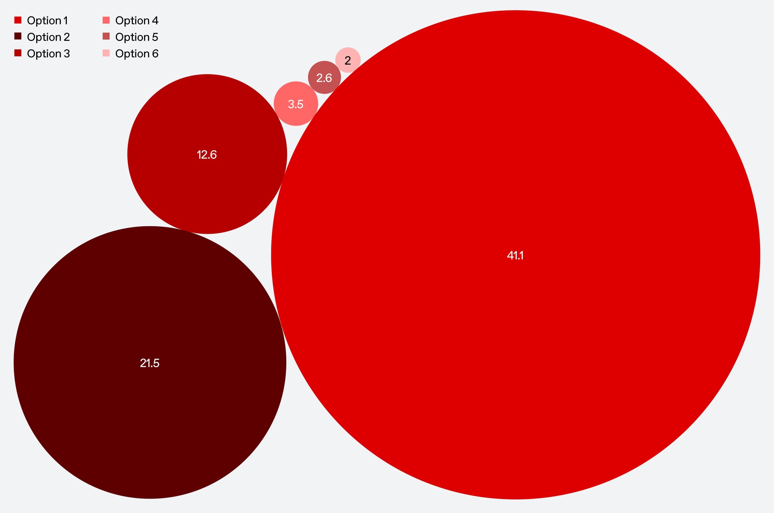
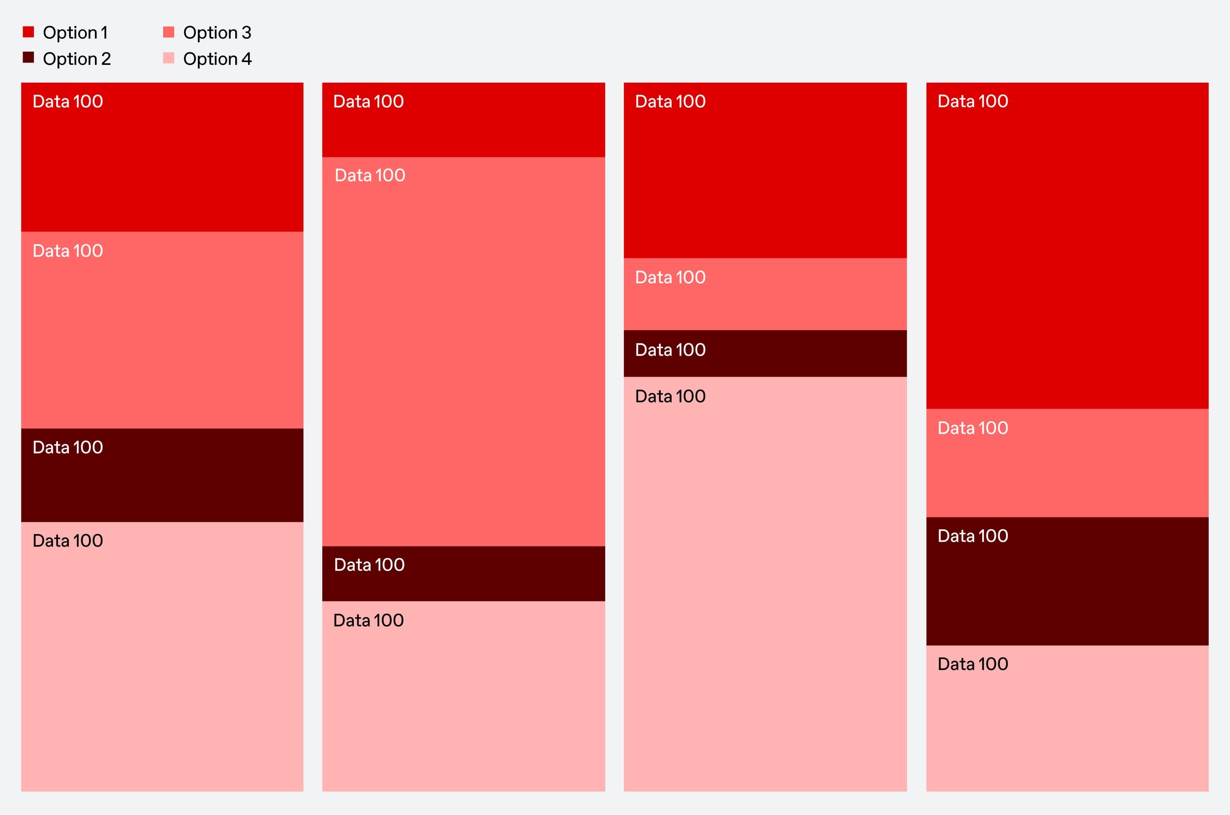
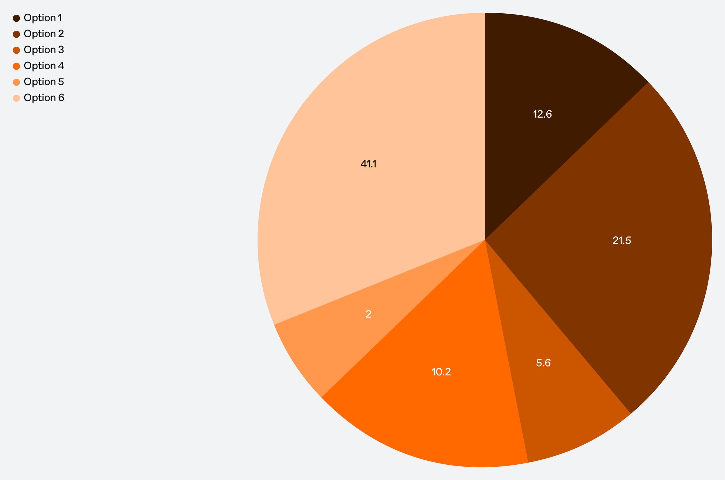
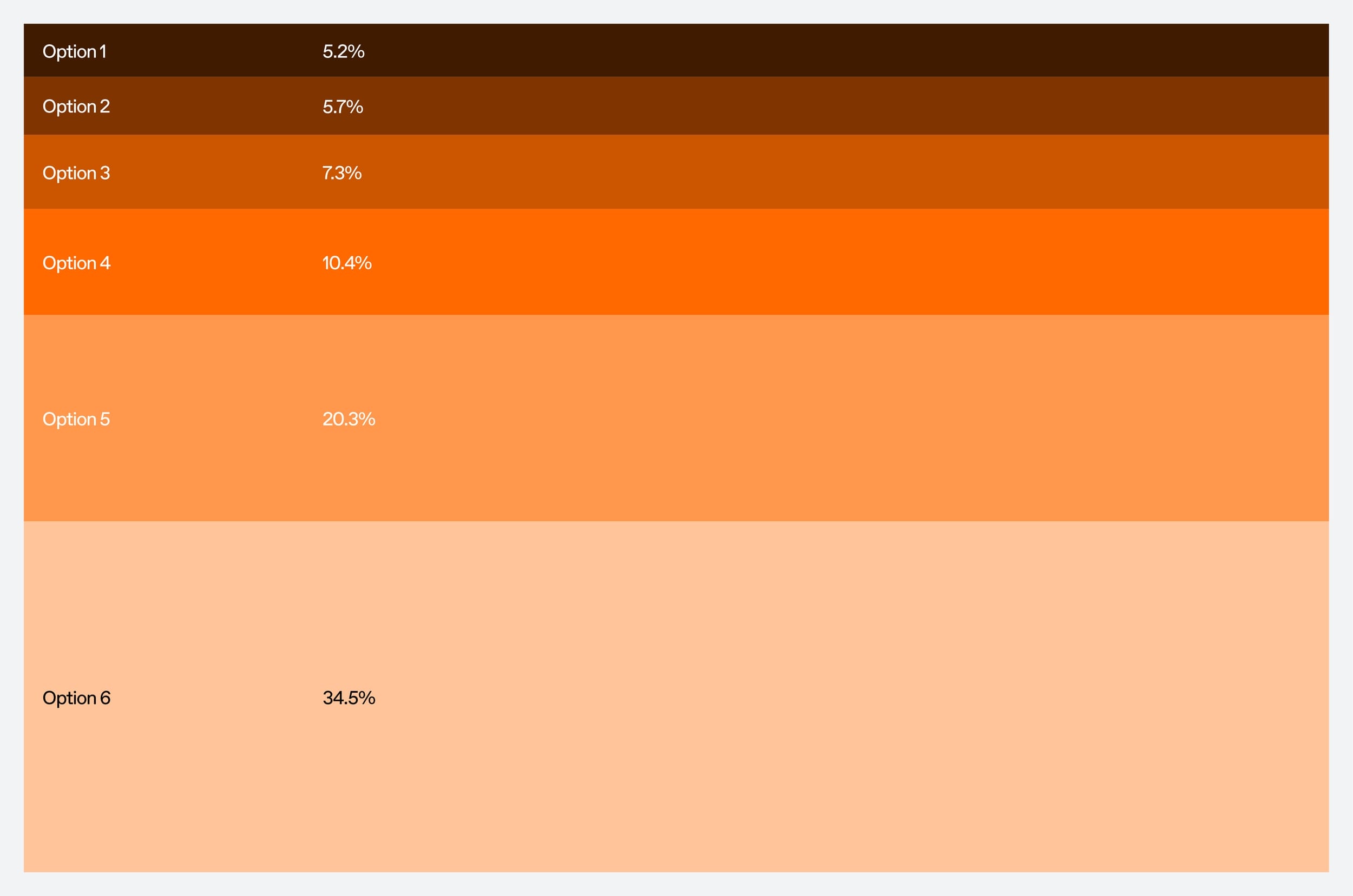
Follow the link to the right to download the infographics
Colour
Proportions
It is important to strike a balance between the vivid and monochromatic palettes. This equilibrium ensures that the energetic tones of the bright palette harmonise with the understated elegance of the monochromatic hues.
20%
20%
20%
20%
10%
10%
Colour
Accessibility
The following shows accessibility for digital applications when using our brand colours with coloured backgrounds.
Aa White Text
Aa White Text
Aa White Text
Aa Black Text
Aa Black Text
Aa White Text
Aa Black Text
Aa White Text
Colour
Don’ts
